
Biography
I Studied graphic design at the London College of Printing, now the London College of Communication, and left in 1966 to take up the post of Art Editor at the counterculture newspaper ‘International Times’.
Professional practice, spanning 43 years, has been varied, from painting shop fronts to stage sets, producing conceptual illustration for magazines and newspapers, making posters, textile designs, record covers and book covers to exhibiting and teaching.
Counterculture
Participation in the London Counterculture scene in the mid-sixties provided an opportunity to create psychedelic posters, street murals and editorial graphics for the alternative press, galleries, clubs and events promoting the be-ins, love-Ins, happenings and demonstrations that defined the times and acted as a catalyst for the politics and social change of the period.
Psychedelia
Psychedelic posters were produced for the publishing companies Osiris and Big O promoting London events such as the first gathering of psychedelic culture at the UFO club in Tottenham Court Road, the 14 Hour Technicolor Dream concert at Alexandra Palace and the Legalise Pot Rally (1) held in Hyde Park in July 1967.

1. ‘Legalise Pot’. Poster for a demonstration in Hyde Park, London. 1967. Silkscreen

2 ‘The Flying Dragon’ Shop front mural for a hippy tea house in Chelsea. Measuring 10 metres by 12 metres. Painted in 1967.
Mysticism
A developing interest in Eastern Mysticism re-directed pictorial ideas that visualized drug induced states of mind towards images articulating states of consciousness. This new work was influenced by Eastern thought as expressed through Islamic pattern and Hindu narratives amongst other mystical teachings. These ideas appeared in commissions for The Flying Dragon (2), a hippy tea house in Chelsea’s Kings Road, and posters for music events at the Palais de Sports in Paris and the Roundhouse Arts Centre in London.
Changes (part one)
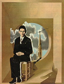
Moved from counterculture to main stream graphics in 1969 with the album cover artwork for ‘Tommy’, the rock opera by The Who (3) after having introduced Pete Townshend to the teachings of Meher Baba. The commission was a natural consequence of our shared interest in Baba’s teachings whose philosophy and principal message of love struck the right note for the times and created, in Tommy, a distinct vehicle for spiritual ideas we both held.

3. ‘Tommy’ unfolding triptych album cover for the rock opera by The Who. 1969
Opinion
Over subsequent years commissioned work reflected a developing interest in the image as opinion, producing editorial illustration for the latest forms of journalism that where evolving at the time. This included new writing by emerging feminist journalists and weekend supplements produced by established newspapers. The challenge was to create thoughtful illustrated opinion that would complement the written social observations, comments and arguments of journalists such as Bel Mooney, Irma Kurtz, Wendy Cooper and Jackie Gillott, for art editors such as David King at the Sunday Times (4) and David Hillman at Nova Magazine (5).

4. The Sunday Times magazine. Front cover illustration for a feature article on readers dreams. 1969

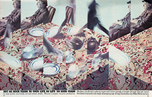
5. Nova Magazine. Double page illustration for an article on old age titled ‘Not So Much Years To Your Life As Life To Your Years’. 1975
Changes (part two)
Work continued to evolve. Methods of work adapted to tighter deadlines. The New Scientist Magazine cover (6) was produced at speed to a very short deadline using a more linear, less painterly style. The ICA poster (7) is an example of recent work which explores new ways of working with black and white ideas through the use of the ballpoint pen. A black biro drawing was used to create filmwork for a traditional silkscreen rainbow effect.
Projects
Current work comments on everyday experiences using contrasting pictorial ideas and methods of practice. Folktales uses everyday activities to comment on traditional customs and beliefs through studio based ballpoint pen drawings. West London portraits, trees and woodland paths is a project created as A2 gouache sketches, painted on-site over an average of three hours each. The work develops abstract brush marks into factual descriptions and is a primary example of improvised making with a risk of failure

6. New Scientist Magazine. Front cover illustrating science in Spain after Franco. 1985

7. Institute of Contemporary Art poster promoting a psychedelic event in April 2007. Silkscreen.
Exhibition
Exhibitions include:
The Whitechapel Art Gallery, London
The Whitney Museum, New York
The Victoria and Albert Museum, London
Schirn Kunsthalle, Frankfurt
Tate Liverpool
The Barbican Gallery, London
The Museum für Gestaltung, Zürich
Work is quoted in films such as ‘Almost Famous’, directed by Cameron Crowe, as well as discussed in the pages of Radio Times, Eye Magazine, Mojo Magazine and featured in broadcasts on BBC Radio 4, GLR Radio and BBC Television.
Awards include a D&AD Silver and Joint Gold Award and a New Musical Express Record Cover Award.
More of the story
Before the practice of graphic design and visual communication, before computers and software like photoshop there was a business called commercial art and studios full of skilled practitioners manufacturing finished artwork.
I took up an apprenticeship in a finished artwork studio in 1960 at the age of 16. Finished artwork studios, in the advertising agency Gerrards and later Saward Baker, was where I learnt to airbrush seemless flat backgrounds for catalogue pages, paste-up expensive gally proofs of typesetting without leaving a smudge, cut frisk film masks for airbrush work, retouch photographs, cast-off type, produce sketch scamps and point-of-sale dummies for client presentations as well as story boarding for film.
I was also involved in freelance work producing Shakespeare In The Park posters for East Ham Council, creating set designs for a local rep theatre company in East London and murals for a jazz club. After a couple of years I achieved some kind of status as a senior vizuaIiser in advertising, but without much sense of achievement. It felt like a small world. It was then I thought about going to art college. In 1963 I started on a pre-diploma course at the London College of Printing.
Study
By 1962 the government was directing art and design education towards a more professional award that could service the needs of an expanding design and communication industry. The National Diploma in Design had given way to the Diploma in Art and ![]() Design after the Coldstream report published in 1961. The report recommended a more broadly based art and design award equivalent in status to a university degree, an award that would apply much stricter academic criteria to the selection of both students and teachers.
Design after the Coldstream report published in 1961. The report recommended a more broadly based art and design award equivalent in status to a university degree, an award that would apply much stricter academic criteria to the selection of both students and teachers.
The London College of Printing was one of the 29 art and design colleges nationally that were allowed to run Dip AD courses. When I applied to the LCP I had no idea I was going to be a guinea pig entering as part of the first year Dip AD intake. The stricter academic requirements meant I had to do part time study to acquire the necessary GCE’s.
The technical training for commercial art which formed part of NDD experience had transformed into the more formal study of Graphic Design. Complementary study and history of art took a larger percentage of study time. This had the effect of moving art 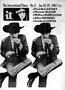 and design away from craft and process into problem solving and ideas based communication.
The London College of Printing did not offer my preferred boho/romantic idea of making art. Though some traditional making classes existed there was little in the way of life class tuition, painting or museum drawing and little opportunity to develop an independent programme of work. Students did not own their working space, they travelled in each day to rooms that delivered particular elements of the course. The curriculum reflected post Bauhaus graphic design with aesthetics linked to European modernism and the new typography practitioners such as Jan Tschichold.
At this point I developed an interest in the idea of emotional design. Communication with sentiment that would correspond to the emotion carried in contemporary songs. Things that made sense on the course came through BFI talks on film directors such as Andrzej Wajda or complementary study seminars on subjects such as time, medium and message, the perception and visual intelligence work of Hans Eynsenck or practical projects involving stone carving with Ralph Beyer or Op projects with Steve Hiett.
 An interest in emotional images led naturally to a growing attraction to illustration as a form of expression. Unfortunately I could not make illustration work at the LCP as the discipline did not exist as a subject on the course. Nor could I bring my growing political interests onto the course. It was only when I returned to the art college environment to teach in 1974 that I could see in what way things had changed post Hornsey and how the learning experience had become more student centred. By 1974 the DipAD had morphed into BA (Hons) and illustration courses were multiplying across the country providing more supportive environments for the discipline. But for now I felt disconnected and left the course when John ‘Hoppy’ Hopkins offered me the job as Art Editor of the counter culture newspaper ‘International Times’.
Working at IT
I first met Hoppy in the summer of 1966. I was already involved throughout the Spring and Summer of 1966 with various political and counterculture projects. Projects that included community action work with George Clark (founder member of CND). I art edited his magazine ‘People and Politics’. It was through George and my involvement with the London Free School that I met Hoppy who asked me to design an LFS logo as well as manage print work and publishing activities for the school including the design of ‘The Grove’ a neighbourhood newspaper which became the template for IT.
The london Free School, at 26 Powis Terrace in Notting Hill Gate, was a proto-community action group, a temporary coalition of post Rachman housing activists which included George Clark, Rhaune Laslett and involved Jeff Nuttall, Hoppy, R D Laing, Julie Felix, Pete Jenner, Brian Epstein, Joe Boyd and Michael Abdul Malik amongst others. It set out to provide local community support and act as an agitprop centre for a number of local issues as well as offering a centre for learning. In its short life it managed to produce the community paper ‘The Grove’ and to kick-start the Notting Hill Carnival. Because of my association with the LFS I was invited by Michael Malik (later to become Michael X) to attended a RAAS meeting with a group of activists including Stuart Hall, in order to discuss visual identity and design matters for the fledgling organization Racial Adjustment Action Society.
By the end of 1966 the time was right for John ‘Hoppy’ Hopkins and Barry Miles to start the counter culture newspaper International Times. It was launched with an event at the Roundhouse on the 11th of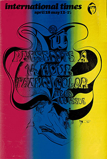 October 1966. After the first couple of issues Hoppy asked me to art edit the newspaper. The newspapers editorial offices operated in the basement of Miles’s ‘Indica’ bookshop in Southampton Row which felt like the centre of an alternative universe at the time.
The launch of IT was one thing but the practicalities of producing such a newspaper could be stressful. Apart from weekly money worries the staff also had to manage fluctuating production conditions. Sometimes we could find ourselves assembling pages in metal at the printers or cutting and pasting paper layouts depending on our relationship with nervous printers.
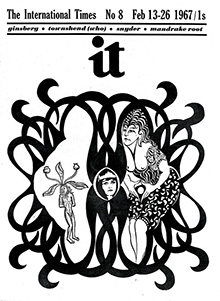
The first couple of issues of IT displayed news in a conventional newspaper layout with headings, sub-headings, text and newspics. Pages of image and text would either be built with hot metal type on linotype machines using engraved image blocks locked into metal galleys for letterpress printing or cut and pasted as paper artwork using typeset paper galleys and paper based images for film work to expose onto thin metal printing plates for offset litho.
I was interested in creating a newspaper with more visual impact, creating covers with the punch of a poster, with stand alone visual statements or links to major articles, as well as more animated page layouts. Offset litho printing created greater opportunities to be playful and expressive with the layout and provided the possibilities to take the paper in a more psychedelic direction.
The police raid on the IT office in March 1967 with a warrant issued under the Obscene Publications Act was no surprise to me, but it created great  difficulties.
 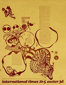 We struggled to keep things going without a mailing list and other office essentials for the running of a newspaper. I remember that some people, including Mick Farren, rallied around to produce an emergency half-issue (IT 10.5) as speedily as possible which we then printed and distributed on the streets of central London as an act of defiance.
The best bit after the raid was the planning for a ‘Death Of Free Speech’ wake with Harry Fainlight that appeared on the streets of London, complete with coffin, after an all night session at UFO. The parade of mourners wove their way to the Cenotaph and then onto the Circle Line of the London Underground. We where stuck on the Circle Line until Harry, who was now in the coffin, could decide if he was resurrected or not. The rage in the tabloids that followed the Cenotaph happening missed the point of the gesture. Young people had died in WW2 for the right of this generation to demonstrate and defend their understanding of free speech. That right was never taken lightly.
I was 22 and in a time and a place that seemed to be the centre of gravity for all experience. I could see 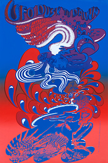 the latest OpArt show at Indica Gallery, browse the words of Alan Watts, RD Laing and others for free in Indica bookshop then pop into the offices of IT in Indica’s basement and listen to Tom McGrath analyze a good piece of copy. I could partner with Graham Stevens on a two hour interview with Buckminster Fuller and drop into Jack Henry Moore’s flat in Covent Garden for a meeting to organise the IT benefit concert at Alexandra Palace as a 14 hour free speech event.
I was asked to design the poster for the ‘14 Hour Technicolor Dream’ IT benefit at the Alexandra Palace. Other duties for the event included a search with David Howson for a Helter Skelter to place in the vast hall of the Alexandra Palace. The search took a kaleidoscope group of people in a rainbow car, courtesy of Binder Edwards Vaughan, into the outer reaches of London on a sunny day to the winter quarters of a traditional fairground company. The whole enterprise must have looked like an alien invasion. I remember little of the all night event except the following morning and the feeling that something unreal had happened.
My direct involvement with IT came to an end with issue 13 published at the end of May 1967. It contained a report on the ‘14 Hour Technicolor Dream’. After I left IT I looked for alternative sources of income. This included poster work for Peter Ledeboer’s Big 0 and Joe Boyd’s Osiris poster companies and illustration work for Richard Neville’s OZ Magazine. There was a short lived scheme to create a graffiti squad with Martin Sharp, David Vaughan and others with the idea of spreading the counterculture message across London. We had a brush with the law on the first night which put an end to the project.
The posters
The hippie subculture was expanding with young entrepreneurs creating businesses that required distinct visual imagery. Osiris and Big 0 were formed to commission and supply posters to an expanding poster scene. This form of print was ideal for counter cultural activities such as the UFO club. The UFO Club was created by Hoppy and Joe Boyd to fund IT. It opened its doors on December the 23rd 1966 in the premises of the Blarney Club, Tottenham Court Road. I helped to organise the door, stalls and food as well as produce the occasional poster. The club opened on a friday night at 10 and continued till the next day. As well as 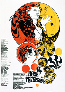 live rock music from Clapton, Hendrix, Soft Machine, Pink Floyd etc. There where Mark Boyles light shows, theatre, happenings, film shows and market stalls that sold hippie paraphernalia. I remember vividly the stairs from the street down to the club and how, over a very short space of time, a trickle of people became a flood as the dam burst and released a psychedelic wave of people to fill the basement of the Blarney Club that had become, for a night, the UFO club.
The posters I produced in 1967 and 1968 seemed to form themselves into two groups. Posters that could be characterised as ‘psychedelic’ produced during the time I worked for IT and the UFO club and posters that could be characterised as ‘Spiritual’ produced during the Omtentacle partnership with Dudley Edwards.
Psychedelic posters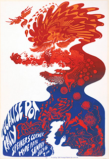
The psychedelic posters I produced were an attempt to illustrate states of mind associated with drug taking using the visual vocabulary of organic shapes found in art nouveau/jungendstil as well as physical ideas of softness, meltingness, liquidness and poured forms. The impact of LSD and other psychedelics had both a positive and negative effect on my work at the time.
There was a creative buzz in defining a search for the visual vocabulary that would best express the condition or sensation of being high and working within the context of shared cultural interest with others. But things could become a bit paranoid at times, living in a world of two tribes, ‘Us’ and ‘The Grey’s’. Making psychedelic images became an ever narrowing world of expression. A world difficult to communicate unless you shared the experience of LSD.
Aesthetically the making of psychedelic images changed the way I thought about composition. Elements of a 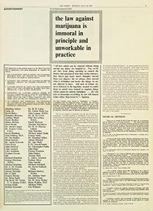 picture could swirl around in all kinds of ways. I enjoyed working with soft forms rather than the hard horizontal and vertical elements of modernist graphic design. At the time there was a Victorian/Edwardian flavour creeping into print graphics. At college I used to collect old shop signs and pictorial advertising from between the wars. There was a shift in fashion from modernism into retro-visual ideas reflecting the organic forms of Art Nouveau. The V&A held a pivotal show of Aubrey
 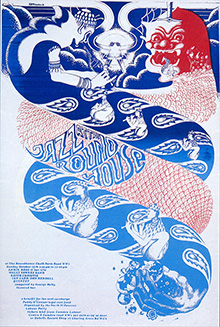 Beardsley’s work in 1966 which, along with Arthur Rackham, Edmund Dulac, fairy tale goblins and princesses etc, influenced the psychedelic work of designers such as Michael English and Nigel Waymouth.
I was drawn towards optical patterns, floating forms, poured forms, bubble forms and the appearance of liquid. I also enjoyed using Greek myth as well as fairytale for some of the poster narratives. I had always appreciated hand lettering and found great pleasure in forcing letter forms into a twisted geometry that made the words illegible. I used gradated inks (one area of colour blending into another) for both silkscreen and litho psychedelic posters. This technique attempted to express the floating state of drug experience.
Posters with a spiritual message
Previous psychedelic experiences, developing interests in things spiritual and the nature of consciousness developed into a curiosity for mystic ideas. Ideas expressed through eastern religions, poetry and philosophy with Its emphasis on inner consciousness and the individual spiritual journey. The visual ideas contained in such things as Islamic pattern, Sufi poetry and Hindu symbolism etc. created an alternative pictorial narrative for the work I produced at the time.
Meher Baba
I married in May 1967 and took the party to Hyde Park. We had the painted Buick of Binder, Edwards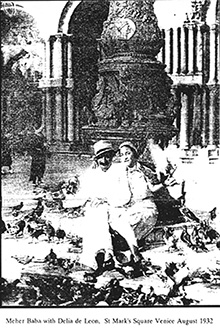 Vaughan, Greg Sams macrobiotic picnic, a steel band organised by Michael X, wedding outfits designed and made by Karen Townshend and Hoppy as best man. Hoppy created a media event out of the wedding, on the following day (May 14 1967) the Sunday Mirror produced a double spread on the illegal reception party held in Hyde Park.
During the summer of 1967 I moved to a flat in Shaftesbury Avenue. I was invited by Dudley Edwards, a partner in Binder, Edwards, Vaughan, to a Meher Baba meeting at the Poetry Society in Earls Court where I met Delia de Leon and Tom Hopkinson. In the early part of Autumn Pete Townshend came to a party held at the Shaftesbury Avenue flat for the Dutch psychedelic couple Simon Posthuma and Marikje Koger (The Fool) where we spent the night talking about Meher Baba.
A developing interest in eastern philosophy and the spiritual teachings of Meher Baba led to the ‘Omtentacle’ partnership with Dudley Edwards. The ‘Omtentacle’ partnership was devised to create schemes that would bring spiritual ideas to illustration and design. The partnership was active between September 67 to the spring of 68. Omtentacle commissions were the ‘Flying Dragon’ restaurant and the ‘La Fenetre Rose’ and ‘Jazz at the Roundhouse’ posters.
The brief for the ‘Flying Dragon’ Restaurant 436 Kings Road, Chelsea, reflected ‘Omtentacle’s’ interests in eastern themes and 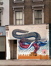 aesthetic. The restaurant commission came from Pussy Weber (joined later by her partner Barbara Allen) who was introduced to us by Miles. Pussy Weber’s interest in the ‘I Ching’ led to the theme of the heavenly and earthly dragon for the exterior theme and the spirit of the white horse that roams the earth for the interior theme.
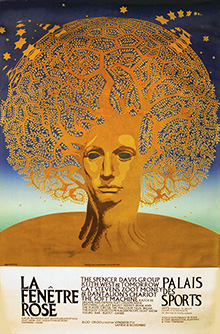
John Esam, the editor of Image magazine, commissioned the ‘La Fenetre Rose’ poster in September 1967 for a concert at the Palais des Sports in November that year. It was a 30 x 40 inch, three colour offset litho poster in blue, gold and brown. Each colour was made with hand separated artwork on overlays working same size to the printed image. Each leaf painted by hand whilst kneeling on the floor. 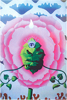 I went over to Paris with David Medalla as part of the Exploding Galaxy Ballet to play hand drums for their concert performance at the Palais des Sports.
The contemporary poster market was flourishing. Posters where carrying all kinds of messages advertising counter culture and political events as well as promoting transcendental and poetic messages. It was a very flexible form of publishing, a format that carried the underground message very well, being both cheap and accessible. Though the boom in posters only lasted a couple of years, the posters still attract cultural interest to this day. In January 1968 the Geneva based Gallery 5 held an exhibition of psychedelic posters which included the work of Omtentacle and Hapshash. The Daily Telegraph colour supplement ran a feature article entitled ‘The Men Behind the Poster Boom’ written by Marina Warner which appeared in April of the same year.
Other ‘Omtentacle’ schemes included wallpaper ideas for Sandersons and various projects proposed to the Apple shop in Baker Street and Apple Offices in Saville Row. Non of these projects bore fruit.
A change of scene
 In the Autumn of 1967 I moved to Cardigan Road in Richmond, Surrey, the last station on the district Line. Early Baba meetings were held at the flat for those people interested in discussing his teachings. A small community of friends, with a shared interest in Baba, came together in the area including Pete and Karen Townshend and Ronnie Lane (of the Small Faces) with his wife Susie. Delia De Leon and Tom Hopkinson lived near by. Ronnie Wood and Ian McClagan of ‘The Faces’ group also became near neighbours.
I continued to commute to 436 Kings Road, Chelsea to complete the commission on The Flying Dragon shop front. In the meantime I was managing to get by on a few counter culture commissions via OZ magazine and occasional posters and proposals for record covers. The Flying Dragon was commissioned in October 1967 and completed at the end of January 1968, four months spent working on scaffolding over a very cold winter painting with fingers that refused to move. The restaurant opened in February 1968 and closed in December the same year after the suicide of Pussy Weber. Ettore Sotsass of ‘Olivetti’ and ‘Memphis’ fame, commissioned a photo essay on London shop fronts from Tim and Janet Street-Porter. A visual essay that included the Flying Dragon shop front pasted with fly-posters after it had closed for business.
Early in 1968 I had moved into an apartment that was part of a Victorian villa called Willoughby House on the Twickenham side of Richmond bridge. The house was reputedly the former love nest of Lilly Langtry and the Prince of Wales. The apartment provided studio space for freelance work which was soon to expand after the commission of the ‘Tommy’ record cover. The apartment also led onto a walled garden which provided a venue for warm summer parties, Baba events and occasional location for documentary filming. The studio also functioned as a Baba office in response to increasing Baba activity. Activities that included the organisation of devotional meetings and the London visit of Dr Alan Cohen, a colleague of Dr Timothy Leary. Dr Alan Cohen’s lecture tour focused on Baba, drugs and consciousness and was launched at the Arts Lab in Drury Lane, founded and run by Jim Haynes.
The Reverend Ken Leech was a visitor to Willoughby House. He would come with Delia de Leon to discuss issues regarding  homeless teenagers in London. Ken ran a vicarage and homeless mission at St. Annes Church Hall , Trafalgar Square. Jeremy Sandford, the author of ‘Cathy Come Home’, visited as part of his research into spiritual alternatives to drug culture. The screening in 1966 of ‘Cathy Come Home’ led directly to the setting up of the homeless charity ‘Shelter’. Homelessness was, and still is, a live issue which led to direct action in the form of squatting in the 1960’s and 1970’s. Shirley Du Boulay, BBC producer of religious programmes produced a programme called ‘The Timeless Moment, experienced through drugs, madness and mysticism’. Part of this was filmed at Willoughby House in 1968 and broadcast in 1970.
God gets a credit
I have this memory of sitting in Pete Townshend’s kitchen towards the completion of cover artwork for the Who’s rock opera Tommy. We were trying to find a way of placing God on the cover copy. The Indian word for God is Avatar and, for us, his name was Meher Baba and the cover credit list is where we put him. Placing Avatar as a job description on the cover of the album was appropriate, Baba being the glue that bound the range of ideas that Pete gathered and wove together to make the whole experience of Tommy.
 Since our first chat about Meher Baba in the Shaftesbury Avenue apartment there had been many social occasions and Baba meetings where his teachings and their relevance to contemporary issues had been discussed, sometimes into the early hours. As the Baba group expanded Pete offered his Soho apartment as an official meeting place. We were living as close neighbours to Pete and Karen in Twickenham by the time he asked me to do cover artwork for Tommy in September 1968. Pete had originally considered Alan Aldridge for the cover but the decision to commission me seemed to fit the evolving musical ideas being shaped by his developing spiritual interests.
I began visualizing ideas for the album design and talking these through with Pete as his work progressed in the recording studio. Ideas which Pete acknowledges influenced the way some of the songs, in raw demo form at the time, would turn out. Pete left me to it. I was amazed at just how relaxed the group would be to a cover idea that presented a symbolic image of the opera with no photographs of the band. It was Decca, with the American market in mind, who insisted on group portraits for the cover. Kit Lambert, the Who’s manager, kept a watchful eye on things as they progressed. Kit was very excited by the whole project. He held bohemian ideas about the artists who worked for him. Romantic ideas possibly influenced by his family background. Kit’s father was Constance Lambert, a classical composer of English music inspired by traditional British folk songs. His artistic vision drove the belief that Tommy was an important pop/classical fusion project. As the project progressed the idea of a fusion between popular culture and high art inspired Kit to publish the first 50,000 print run of the album as a limited edition. The numbered run replicating limited edition fine art prints sold in art galleries. The gesture was more about the creative rather than monetary 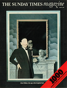 value of the project.
Kit and Pete where very supportive as the original brief expanded from a 12 inch cover proposal to a triptych cover with a 12 page booklet of lyrics. Both Pete, Kit and the band knew how important this project was to the development of The Who. I spent three months on the artwork visiting the recording studio as the album progressed. The project was completed in January 1968. The production people at Polydor Records in London produced the first, and the best, printing with the London printer Ernest. J. Day & Co. I was in Morocco when the album came out, on my return things changed.
From friends to clients
 Since leaving college all commissions for work had come from friends and acquaintances in and around the counter culture scene in London. Tommy had been the right vehicle for the visual interests I had at the time. These included surrealism, not for its subversive qualities but the transcendental possibilities of the image, like finding poetry in the ordinary. Further interests included the psychology of perception and contemporary Op Art. Design work began to give way to a freelance career in illustration reflecting a developing interest in the image as opinion. This would evolve into subject matter that expressed wider cultural and social issues, comment and opinion for magazines and newspapers.
The Sunday Times
In the summer of 69 I was commissioned by David King at The Sunday Times Magazine to produce five illustrated portraits for a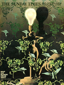 large editorial project called ‘1000 Makers of the Twentieth Century’, a project that ran for many months. The magazine was commissioning a wide range of image makers including the artist Kitaj, the photographer David Bailey and the illustrator Robert Grossman. I was given a large list of names and asked to choose five to illustrate as portraits. The commission provided an opportunity to make a very targeted selection and I was able to select five people that held a lot of meaning for me.
More work came from the Sunday Times magazine in the Autumn. Art editors were beginning to steer particular subjects my way. The next commission dealt with readers dreams which Dave King thought a suitable subject for my picture making interests.
Nova magazine
From its first issue in 1965 Nova held centre stage as a quality women’s magazine, producing some of the finest editorial pages in the business. By 1971 Gillian Cooke, the editor, and David Hillman, assistant editor/art editor developed a distinct visual dynamic with a conceptual shift away from the decorative towards more thoughtful uses of photography and illustration. The pages where packed with ideas and new women’s journalism that brought fresh topics and opinions to the pages of women’s magazines.
 It was a challenge to create images that would work along side the writing of journalists such as Bel Mooney, Irma Kurtz, Wendy Cooper, Jackie Gillott and Elaine Grand. I enjoyed working with subject matter that included social, political and life style issues to create images with a suitable authority that could support journalists writing with its own visual opinion. David Hillman was committed to illustration as a way of developing interpretive images alongside written social observation, comment and argument. The kind of journalism, in a previous decade, that would only have been seen using the ’authentic voice’ of photography.
Opinion
In early 1970 I joined the illustration agency Artist Partners, working with Virgil Pomfrett. The agency was about to set up a New 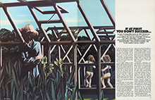 York office and I was keen to develop work into new markets. I had mentioned this in conversation with Pete Townshend and he came back with a proposal from the band to finance my trip to New York. When I arrived I found work producing decorative posters for New English Library, a set of illustrations for a book on Sigmund Freud for Readers Digest, science fiction covers for Simon and Schuster and Bantam Books and, through Barry Miles, a record cover for Alan Ginsberg.
 Miles, who was working out of New York at the time, had arranged for me to stay at the Chelsea Hotel. His network of contacts and acquaintances in New York was impressive. The month I spent there was full of parties, meetings and encounters including drinks at Max’s Kansas City with Claus Oldenberg and Robert Rauchenberg. I got to know Harry Smith, a fellow resident of the Chelsea Hotel, during my stay there. The ‘Harry Smith Anthology’ was the bible of American folk music during the 1950’s and early
  1960’s Greenwich Village folk scene influencing musicians such as Bob Dylan and Joan Baez. Harry was kind enough to show me his extraordinary collection of Seminole Indian patchwork and East European handpainted Easter eggs that he kept in his tiny one bedroom apartment at the hotel.
In September the Tommy cover artwork went across to Oakland, California for an exhibition called a ‘ A Show of Hands’ curated by Robert. H. Ballard at the California College of Arts and Crafts Gallery. In August 1970 The McCann Advertising Agency in Frankfurt flew me over to advise on new visual ideas for Peter Styvesant cigarettes. My proposals where visually obscure and surreal, predating the Benson and Hedges campaigns of the eighties by a decade. They where never used.
In November 1970 Alan Aldridge began commissioning illustrators for volume two of the Beatles  illustrated lyrics book. In the Autumn of 1970 the Design and Art Directors Association awarded two silver and one joint gold award to the Sunday Times for the 1000 Makers and Readers Dreams editorial features. The Sunday Times organised an exhibition at the Grosvenor Gallery in London highlighting illustration work from the 1000 Makers of the Twentieth Century feature. Towards the end of the year the Tommy cover received an award at the New Musical Express awards hosted by Jimmy Saville at the Savoy Hotel.
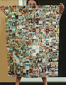
As Ronnie and Susie Lane settled into life as neighbours in Twickenham he was forming a new band with Rod Stewart, Ronnie Wood, Ian McClagen and Kenny Jones called The Faces. In 1970 The Faces brought out ‘First Step’ their first album. The cover shoot took place at Willoughby House with the band on our sofa, used on the  cover, and out in the garden miming their parts in the band, used for the inside cover. A punch drink was created for the occasion, made to an unusually strong recipe, leading to an overly merry end to the shoot. On their next album ‘A Nod’s As Good As A Wink’ Ronnie asked me to do a poster insert. I produced a 3 foot by 4 foot poster containing 349 moments from the life of the band. I also produced stage pieces and banners for the bands first English and American tours.
Leaving London
 I left London in January 1972 and made for the Welsh hills. It seemed an appropriate move at the time. People I knew seemed to be leaving the city for the country as a way of refreshing tired spirits. I bought a farmhouse with 5 acres near Montgomery on the welsh borders. I was nervous about the distance created between me and London clients but they seemed happy to work via the telephone and through parcel post. It was an idyllic setting but I remained worried about making a living.
I began work at the farm in a fair degree of peace and solitude. Alan Aldridge made a surprise visit one day, turning up in my studio to check how it was for an illustrator working in the depths of the country  side. It wasn’t all solitude, there where the occasional weekend parties with Pete and Karen Townshend, Ronnie and Susie Lane, Julie Christie, Janet and Tim Street-Porter amongst occasional visitors to the farm. But the idyll did not last long. I separated from my wife in November 1972 and left the farmhouse to return temporarily to London and then to Pangbourne to take up residence in a riverside summer hut at Pete and Karen Townshend’s country place.
In the summer of 1973 I finally ended up moving into a studio in the Bull Mill complex that was part of the Longleat Estate near Warminster, Wiltshire. I did very little commissioned work during these moves. 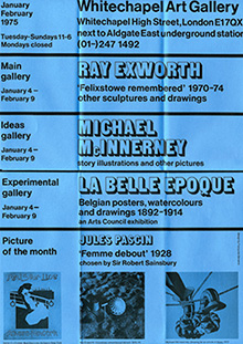 There were one or two shows including a Scottish Arts Council travelling show on the theme of rock graphics and preparation for a 1974 summer group exhibition with ten London illustrators at the Institute of Contemporary Arts in London. Towards the end of 73 I was reconsidering the way I was working. The gouache and pencil illustration work was too slow. I needed more time to rethink work outside commercial deadlines.
Doug Binder suggested I contact Jasia Reichart, the Director of the Whitechapel Art Gallery, and propose a show of commissioned work at the gallery. Jasia agreed to the show and work began over the spring and summer of 1974 in preparation for an opening scheduled in January 1975. The Radio Times magazine came to Bull Mill to do an interview and photo shoot for an article titled ‘Who is Tommy’. The article featured Pete Townshend, Nik Cohn, Roger Daltry and myself as people who each played a part in the development of the 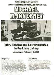 album. The interviews highlighted four very different stories on the making of Tommy. The feature appeared in October 1974.
I produced the occasional commission for clients such as German Playboy but money was tight and I needed to buy time to develop things. I wrote to a selection of art colleges in the west country with a view to doing part-time illustration teaching as a way of generating income to support the studio work. My general enquires triggered a response from Benno Zhender, Head of Graphics at Bath Academy of Art in Corsham, Wiltshire. Benno had considered developing an illustration element on his graphic design course and invited me in for an interview with a view to teaching illustration at the college. In September 1974 I started teaching one day a week at Bath Academy of Art.
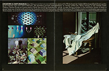 The Whitechapel Show opened in January 1975. David Hillman offered an article on the show. The article, ‘Creating a disturbance’ appeared in the January issue of Nova magazine. At the opening night Pete bought most of the original work.
The pace of work slowed down at Bull Mill. I was writing and taking photographs more than drawing. The pace picked up towards the end of the 70’s. Drawing ideas had developed to the point at which a new folder of work had been created, enough to start approaching art editors and directors in a new 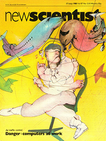 round of freelance interviews.
Return to London
By 1979 I had returned to London with a new portfolio of drawing using an expanded range of materials to create drawing ideas more directely onto paper as finished pieces. The process of work was more immediate with less time taken between commission and finished art. One of the first clients to pick up on this work was Chris Jones at New Scientist.
To be continued